Mobile Storytelling: Tips and Tricks from a Legend
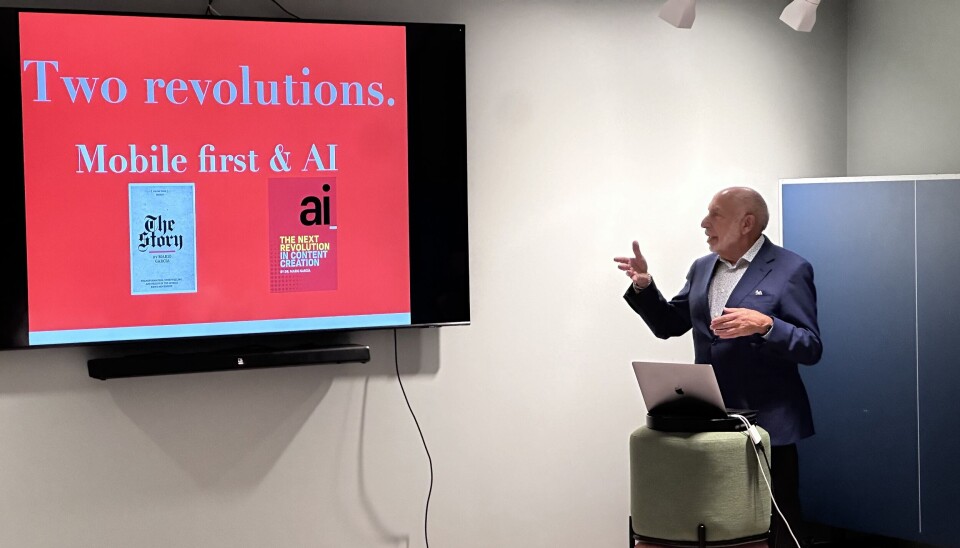
Discover how Mario Garcia's design principles are shaping the future of journalism with Labrador CMS.
We had the pleasure of hosting world-renowned news design guru Mario Garcia in Oslo. As he joined our team to discuss and work on mobile-first editing, he was pleasantly surprised to find many of his mobile storytelling principles already possible to replicate in Labrador CMS.
Garcia's biography is so rich that it almost needs its own article. He spent almost 50 years in media industry, redesigning print newspapers and news sites around the world, including publications like The Wall Street Journal, The Washington Post, South China Morning Post (Hong Kong), New Straits Times (Malaysia) and Aftenposten (Norway).
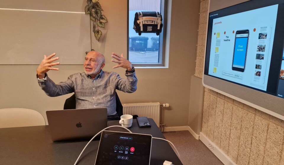
Now 77, Garcia serves as Senior Adviser on News Design at Columbia University’s Graduate School of Journalism. He continues to travel worldwide, delivering workshops through Garcia Media. His teachings focus on, what he calls, two ongoing revolutions in journalism today: Mobile Storytelling and AI.
I have not seen a more intuitive, complete-package system that is in tune with the way content is created for the mobile first era
Mario Garcia, Global News Design Guru about Labrador CMS
Understanding Mobile Storytelling
Garcia describes today's journalism as "the journalism of everywhere and interruptions." With 82% of content consumed on mobile, Garcia’s mobile-first design philosophy is essential. His approach prioritizes vertical layouts and mobile-first content creation, meaning that he suggests creating articles and stories for mobile consumption first and only then adapting them for desktop or print consumption.
Here is a breakdown of Garcia's key mobile storytelling layouts and how Labrador CMS enables journalists to recreate them.
1. The Essential
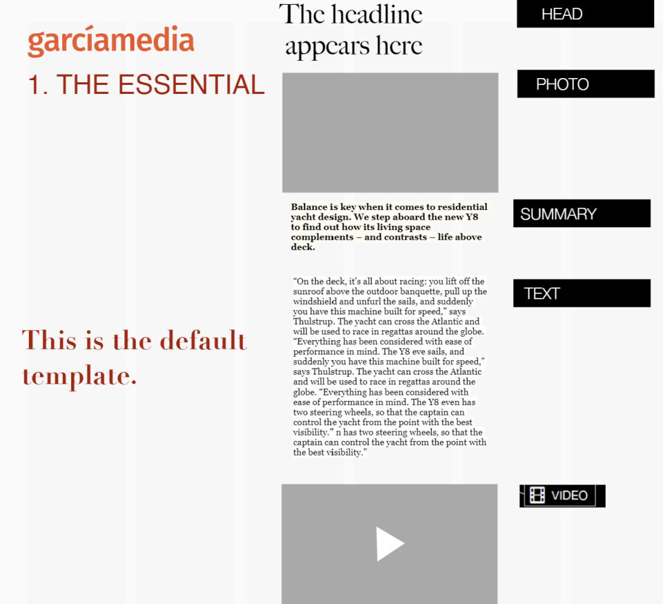
Concept: Separate essential elements—titles, subtitles, images, quotes, and videos that allows to play around and edit and position the separate elements.
Labrador already has all these different elements, ready to be placed where you need them to be.
Implementation in Labrador CMS: Position the Title above the image and line up elements vertically, enabling focused mobile-friendly storytelling.
2. Visual First
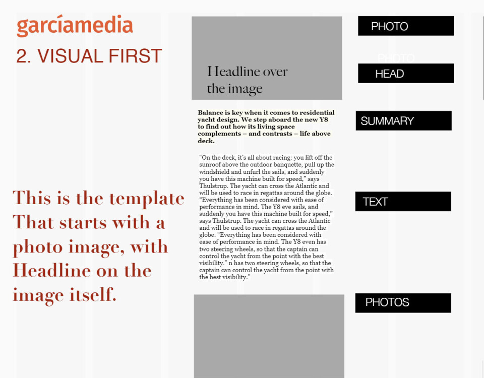
Concept: Lead with images, positioning the Title on top of visuals. Content is linear, scrollable, and chunked into smaller, engaging blocks.
Garcia suggests writing in smaller blocks - to meet the modern lean forward readers right there where they are. Write shorter, more engaging pieces of a story with a focus on immediacy.
In mobile storytelling, content should be linear and easy to scroll through, similar to a WhatsApp conversation. Each part of the story should include visuals or multimedia elements that complement the text.
Implementation in Labrador CMS: Put the title on top of the image, and keep placing images, videos and other visuals throughout the text.
3. Video Intro
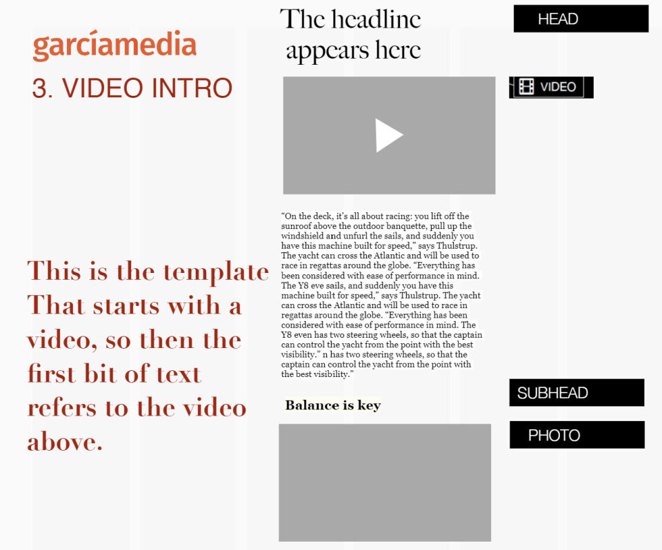
Concept: Begin with video, followed by supporting text. Implementation in Labrador CMS: Insert a video at the top for a dynamic, mobile-friendly introduction. This can be done either with the built in video integration, or by embedding a video.
4. Video Driven
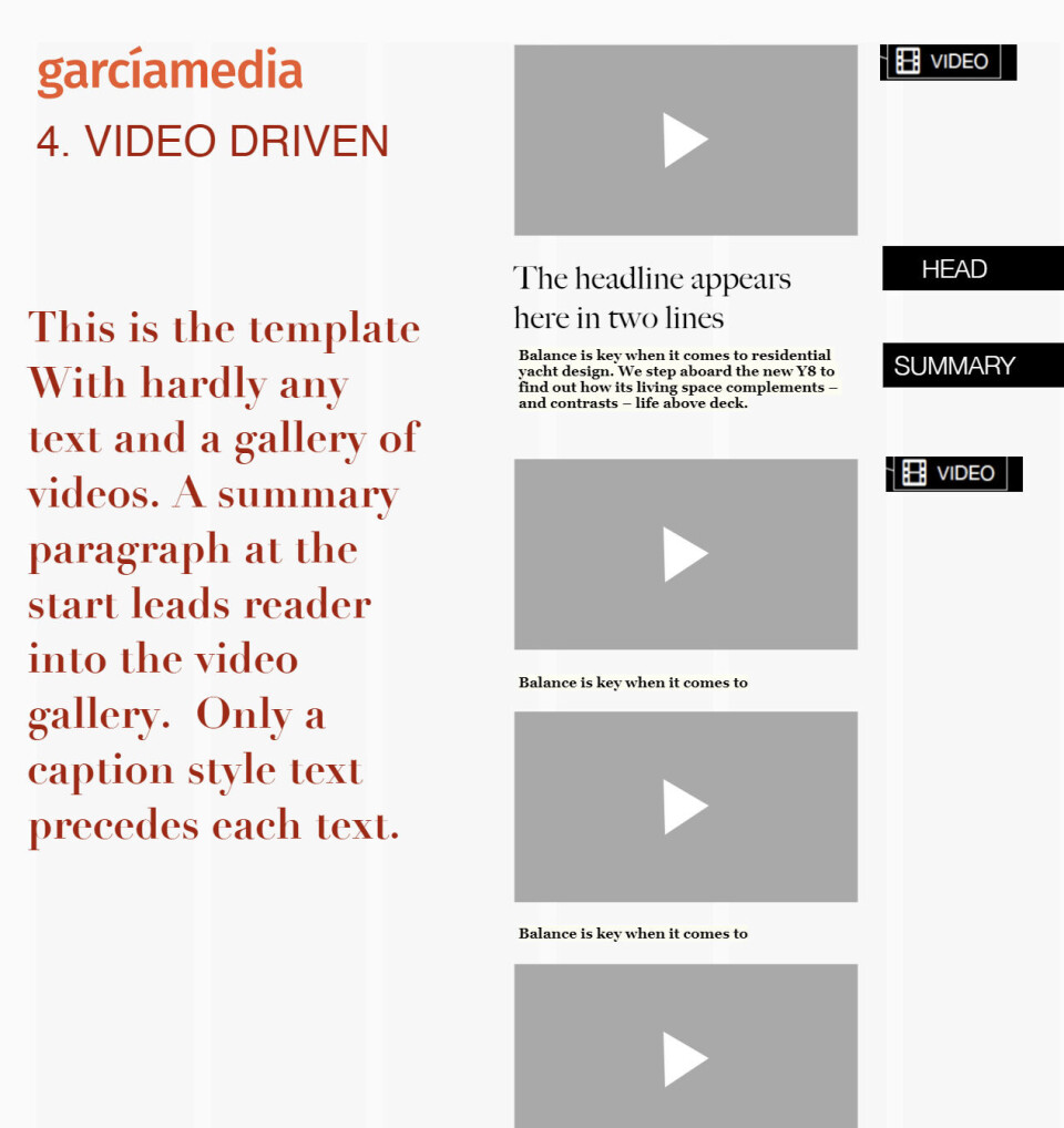
Concept: Video-centered storytelling with minimal text, ideal for immersive experiences.
This layout allows you to tell the audience a story through videos, using hardly any text. As the previous one, it starts with the video on top and Title and Summary under.
Garcia puts a strong emphasis on multisensory storytelling - incorporating various forms of media, including audio and video, to create a more immersive experience.
Additionally, instead of using a text quote, including a video clip of the person speaking can be more impactful.
Implementation in Labrador CMS: Add sequential videos making each clip a primary storytelling element.
5. Landscapes
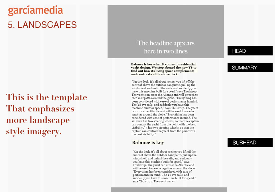
Concept: High-impact visuals with a focus on full-width images. Landscapes layout gives the option of emphasizing two or more high resolution images. As in the Visual first layout the headline is over the picture, and full width picture is the first impression that reader gets. Implementation in Labrador CMS: Use the image editor to display text overlays and full-width images for maximum impact.
6. The Interview
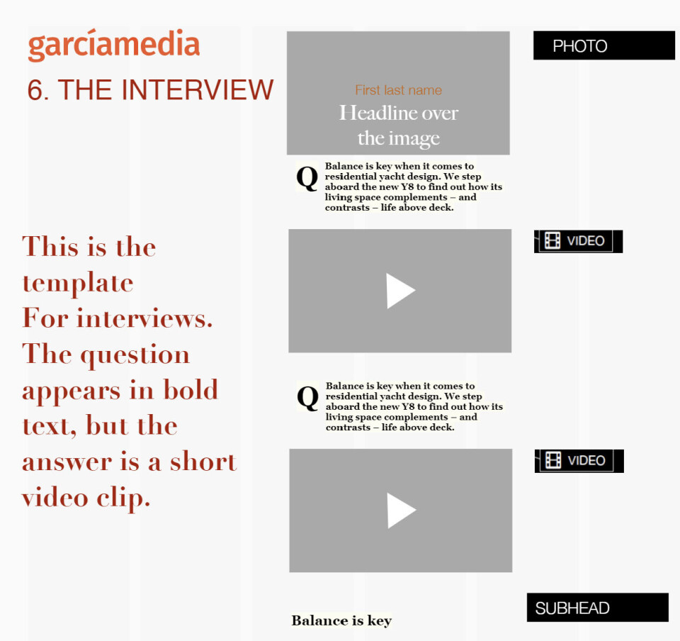
Concept: Video-focused interview clips that allow for interrupted consumption by giving segmenting clips.
This layout is a mobile friendly option for bringing interviews to the readers. It suggests an article made mostly of video clips with the interviewed person, so that the reader can consume it one at a time, rather then having to pause the interview multiple times when he is interrupted with other action.
Implementation in Labrador CMS: Upload clips from YouTube/Vimeo. Add our new Drop Cap feature to emphasize speaker questions visually. Drop cap (One large letter at the start of the paragraph) can be added by going to Styles and selecting "drop cap".
7. The Audio Clip
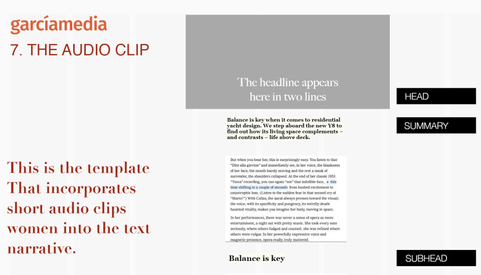
Concept: Highlight audio clips as standalone elements, emphasizing multisensory storytelling.
Note for Labrador CMS: A layout that inspired future features in Labrador CMS is The Audio Clip. This feature is currently under development and it will be a valuable addition for immersive audio storytelling.
Garcia emphasizes the importance of multisensory immersion of the readers and the possibility to incorporate sound into articles, outside of videos, which is a significant contribution when writing news and stories. This is certainly one of the feature on our wishlist and many of our customers.
8. The Photo Essay


The Photo Essay


All photos: Pixabay
Concept: Image grids for impactful photo storytelling. The latest feature in Labrador CMS actually comes inspired by The Photo Essay layout from our collaboration with Mario Garcia. Implementation in Labrador CMS: Use the Grid element to create photo grids, offering a visually rich layout. You can read more on this features and other features we've released in September in this article.


